SUBSCRIBE
View Issue
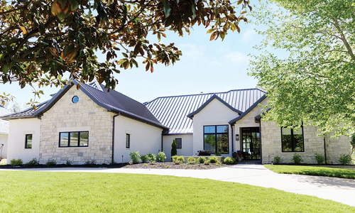
Take a tour of the gorgeous homes that won 417 Home's 2023 Design Awards.
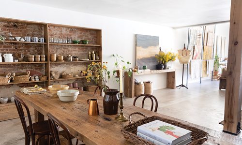
On historic Commercial Street, Sunset by Freeman Home is a one-stop-shop for vintage finds, laid-back decor, heirloom-quality furniture and custom kitchens.
A local family creates the next century for their family farm, inspired by childhood memories.
Explore home design inspiration with expert advice from designers in Springfield, Missouri.
The Munizes’ front porch is perfectly balanced with soft neutrals and floral pops of color.
The Concepts by Design team is composed of experts in cabinetry and closet design.
Mark and Mary Eck work to cherish their Meadowmere home’s history while continuing to breathe new life into their beautiful historic home.